Kleur & Vorm Logo Kleur & Vorm Contact
Contact

Kleur & Vorm B.V.: Designing with Purpose Through Type and Color

We’re transforming how web design communicates through thoughtful typography and strategic color theory. Based in the Netherlands, we work with designers and brands across Europe who understand that every typeface and hue tells a story.

Kleur & Vorm B.V. studio werkplek met typografie ontwerpen
400+ Design Projects
15 Years Experience
28 Team Members
3 European Locations

Where Typography Meets Visual Strategy

At Kleur & Vorm B.V., we’ve built our reputation on deep expertise in two interconnected disciplines. We don’t just select fonts and colors—we engineer visual systems that strengthen brand identity and improve user experience across digital platforms.

Web Typography

We craft responsive type systems that scale beautifully across devices. Our work covers font selection, hierarchy, spacing, and readability optimization. Every typeface choice reflects your brand voice and serves your users.

Color Theory Application

We develop strategic color palettes grounded in psychology and accessibility standards. Our color systems balance aesthetics with functionality, ensuring contrast requirements are met and emotional impact is maximized.

Visual Style Systems

We build cohesive visual languages that unite typography and color into memorable brand experiences. From startup websites to enterprise platforms, we create systems that scale and evolve with your needs.

Implementation & Code

We’re not just designers—we understand frontend development. We build CSS systems that make our typography and color strategies performant, accessible, and maintainable for real-world production environments.

Accessibility First

Every color combination we recommend meets WCAG standards. Every typeface we select works for readers with dyslexia, low vision, or color blindness. Inclusion isn’t an afterthought—it’s foundational to our process.

Measurement & Iteration

We test our typography and color choices with real users. We measure readability, track engagement metrics, and refine systems based on performance data. What we design isn’t guesswork—it’s validated through research.

Kleur & Vorm B.V. doesn’t follow formulas. We’ve spent fifteen years understanding how different industries, audiences, and platforms demand different solutions. What works for a financial services website won’t work for a creative agency. That’s why we start every project by listening to your specific challenges.

Our process combines research, strategy, and craft. We’re not designing in isolation—we’re designing systems that teams will actually use, users will appreciate, and metrics will validate.

01

Discovery & Research

We analyze your brand, your audience, your industry context, and your competitors. We look at what works in your space and what’s being overlooked. We conduct workshops to understand your visual preferences, and we research your target users’ typography and color expectations.

02

Typography Framework

We select typefaces that reflect your brand personality and serve your users. We establish clear type scales, line heights, and spacing systems. Everything’s designed for responsiveness—how typography behaves at 320px matters as much as at 1440px.

03

Color Palette Development

We build strategic color systems grounded in theory. Primary colors, secondary accents, functional states (success, error, warning)—everything’s tested for contrast and accessibility. We document how colors shift across light and dark modes.

04

System Integration & Testing

We implement systems in CSS, create component libraries, and test across browsers and devices. We validate readability with real users. We iterate based on feedback. The result isn’t a static design—it’s a living system that evolves with your brand.

Kleur & Vorm B.V. started in Amsterdam in 2009 because we saw a gap. Web designers were choosing typefaces and colors based on trend forecasts and gut feeling. There wasn’t a rigorous approach to visual systems. So we built one.

Our founders—three designers trained in both graphic design and frontend development—spent the early years experimenting. We worked with startups, we worked with cultural institutions, we worked with government agencies. Each project taught us something new about how typography and color affect user behavior, brand perception, and accessibility.

Kleur & Vorm B.V. team samenwerking aan typografie en kleurtheorie projecten

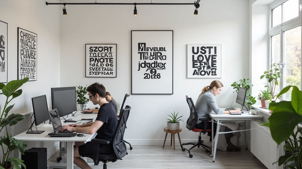
By 2015, we’d developed a methodology. We documented it, refined it, and started teaching it. We’ve trained hundreds of designers across Europe. We’ve built systems for platforms serving millions of users. We’ve consulted for brands where typography and color are genuinely critical to their market position.

Today, we’re still experimenting. We’re exploring variable fonts, dark mode design systems, and how AI tools change our workflow. We’ve expanded to Berlin and Copenhagen, but Amsterdam remains our home. We work with about 25-30 active clients at any given time, which keeps us deeply engaged with real problems rather than distant from implementation.

Why We’re Different

We’re not a design agency that happens to do typography. We’re not a typography foundry that dabbles in web. We’re specialists who’ve built careers around these disciplines.

Research-Backed
Every decision we make is informed by psychology, accessibility standards, and user testing data.
Implementation Ready
We don’t hand off designs to developers—we’re developers. We understand performance, maintenance, and technical constraints.
Long-Term Partners
We don’t just deliver a project. We establish ongoing relationships where we evolve systems as your brand grows.
European Perspective
Working across Netherlands, Germany, and Denmark gives us insight into diverse markets and design cultures.
Transparent Process
You’ll understand the reasoning behind every typeface selection and color decision. We document everything and explain our thinking.
Teaching & Knowledge
We regularly speak at conferences and publish articles about typography and color theory. We’re invested in raising standards across the industry.

Important Information

The information presented on this website is provided for educational and informational purposes regarding web design, typography, and color theory. While we share insights based on our experience, individual design outcomes depend on many factors including project scope, team expertise, platform constraints, and market context. The strategies and approaches we describe represent our methodology and experience, but results may vary. We recommend consulting with our team directly to discuss how our services apply to your specific situation. This content is not a guarantee of specific results and should be viewed as guidance for informed decision-making in design projects.